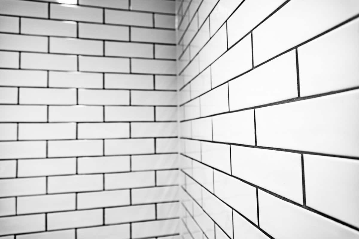
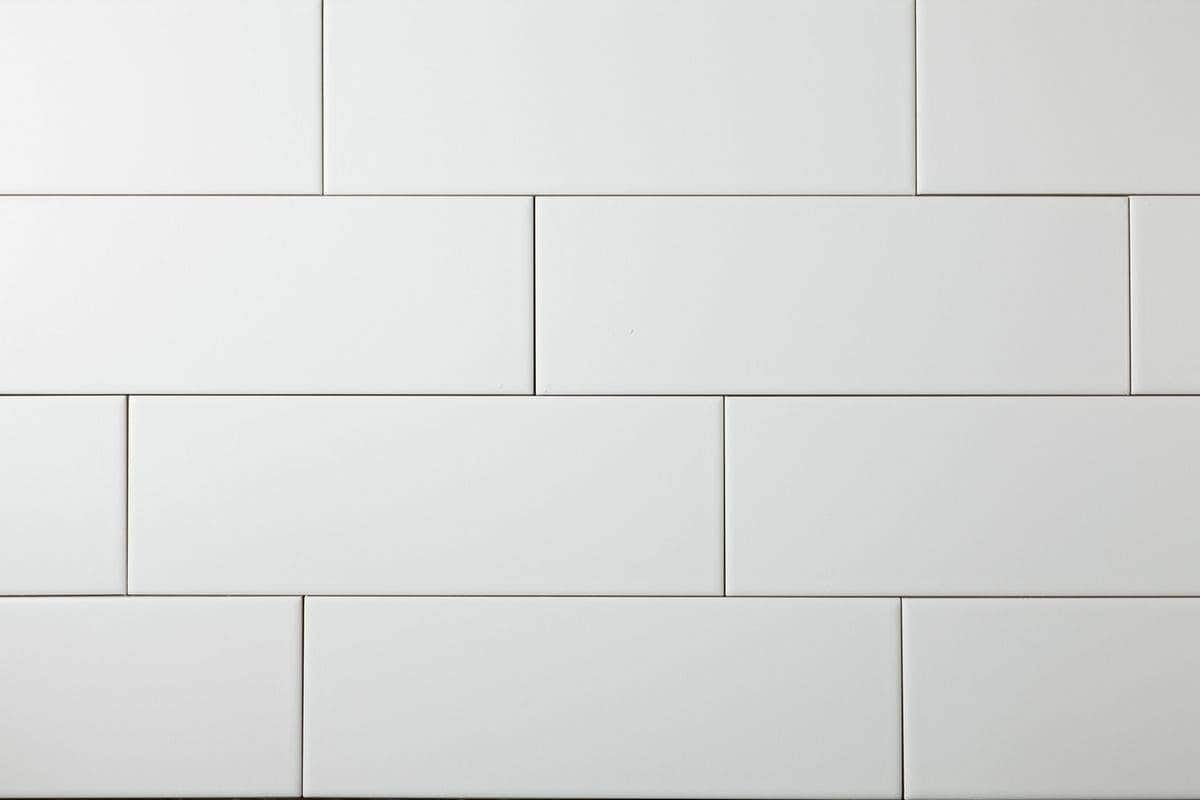
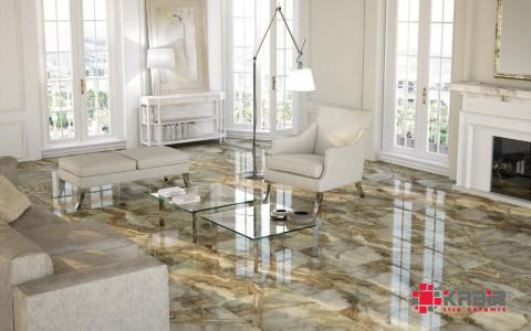
The color of tiles and its size are important factors in determining the beauty in a house if you want to enhance the level of comfort to the interior of your house size 400*250 tiles preferably with a color white or a close one is a top suggestion for the wall.
It can be both entertaining and innovative to select tile colors for your interior design. Simply put, we suggest that you go with a tile color that you really adore.
You will, of course, want to select a tile color that is suitable for the area in question, is consistent with the aesthetic of the rest of your home, and is something that you will look forward to seeing on a daily basis. Utilizing these criteria will assist you in narrowing down your options. One more thing to take into consideration is how you will feel when you look at a particular tile color.
The use of color psychology in interior design is a useful technique because it takes into account the many different feelings that are connected with a particular color.
Because colors can have an effect on how you think, feel, and behave, one of the most important steps in selecting the appropriate tile color is to examine the ambiance you wish to cultivate in a particular space and the color that will contribute the most to achieving this atmosphere.
According to the laws of physics, color is defined as the reaction of our eyes and brains to particular wavelengths of light that are reflected off of objects.
When we think of color, we frequently think of the paint color wheel, which states that red, yellow, and blue are the main colors from which all other colors are derived. When we think of color, we frequently think of the paint color wheel.
If you mix the basic colors together, you’ll get the secondary colors — green, orange, and purple — as a result (or violet). The following color pairings, yellow-green, blue-green, blue-purple, red-orange, and yellow-orange, when combined, produce the tertiary colors and complete the color wheel: red-orange, yellow-green, blue-purple, and red-orange.
If you want to use the color wheel effectively in interior design, it is helpful to have a fundamental understanding of the following aspects of the color wheel:
- Complementary colors are colors that are completely opposite each other on the color wheel. These colors (such as violet and yellow or orange and blue) are often a good choice for use as accent colors.
- Triads are hues that, when placed next to one another on the color wheel, make a triangle. Some examples of triads include the colors red, blue, and yellow as well as violet, green, and orange. Triads have the potential to perform well as accent colors, but in order to prevent them from dominating the area, they need to be balanced.
- Analogous colors are groups of three hues that are located directly next to each other on the color wheel. Some examples of analogous color groups include red, orange, and red-orange.
- Monochromatic colors: A monochromatic color scheme consists of just one hue, but it may include many different tones of that color. For instance, it may range from a light mint green to a dark forest green.
- Cool colors include blues, greens, and purples, which are hues that remind us of water or grass and, as a result, convey a cool mood. Warm colors, on the other hand, include oranges, reds, and yellows. Warm hues, such as reds, oranges, yellows, and pinks, evoke a sensation of warmth within us because they make us think of fire or the sun. The utilization of either cold or warm tones in a certain area can assist in the production of a particular disposition.
- Noncolors: Noncolors are hues that aren’t on the color wheel (like white, gray, black, beige, and brown), but they are still very essential in interior design. Noncolors include white, gray, black, and beige.
So, what exactly is the thought process behind each different hue of tile? Let’s find out.
Beginning with what is widely considered to be the most daring color on the color wheel, red tile conjures up images of love, passion, and desire as addition to power, energy, strength, danger, and conflict. Think of red tile as a tool that may heighten the senses, elevate energy levels, and stir up enthusiasm. Red tile is the kind of hue that produces an unforgettable first impression and gets people talking.
Obviously, the color of red that you decide to choose have a significant impact as well:
- Light red denotes affection, ardor, sexuality, sensitivity, and happiness.
- Pink symbolizes love, friendship, and romantic relationships.
- A rusty brown color represents autumn and the harvest.
- Dark red represents determination, vitality, boldness, leadership, and yearning.
How to use red tile: Red tile may be utilized as a nice accent to warm up a space that has been described as “cool,” or it can create a dramatic impact when used in larger applications or for a whole room (think of a red tile alcove or bathroom). It is also believed that the color red stimulates appetite, making it a good choice for use in kitchens. When applied to a tile feature wall, the color red has the ability to visibly shift the proportions of a room that is long and narrow.
Alter the effect of the red tile by combining it with tiles of other colors. For instance, when used in conjunction with softer grays and magentas, the color red has the ability to impart a sense of coziness and femininity to a room. The use of earth tones in conjunction with a rustic red tile creates an atmosphere that is both cozy and authentic. In a general sense, purple-reds convey a sense of calm and intimacy, whilst orange-reds are stimulating.
The color pink has been adopted as the symbol for breast cancer, and now pink tile is following suit as a fashionable way to incorporate elegance and a sense of feminine power into interior design.
The use of pastels, such as blush tile, results in a style that is calm and elegant, whilst the use of strong colors results in a style that is bohemian and industrial chic. Orangish pinks, such as coral tile, give off vibes that are vibrant, buoyant, and yet comfortable.
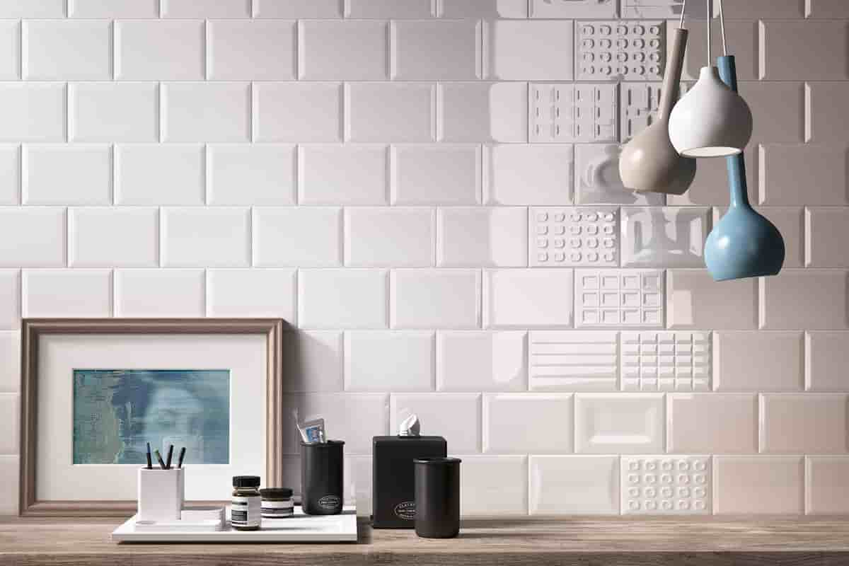
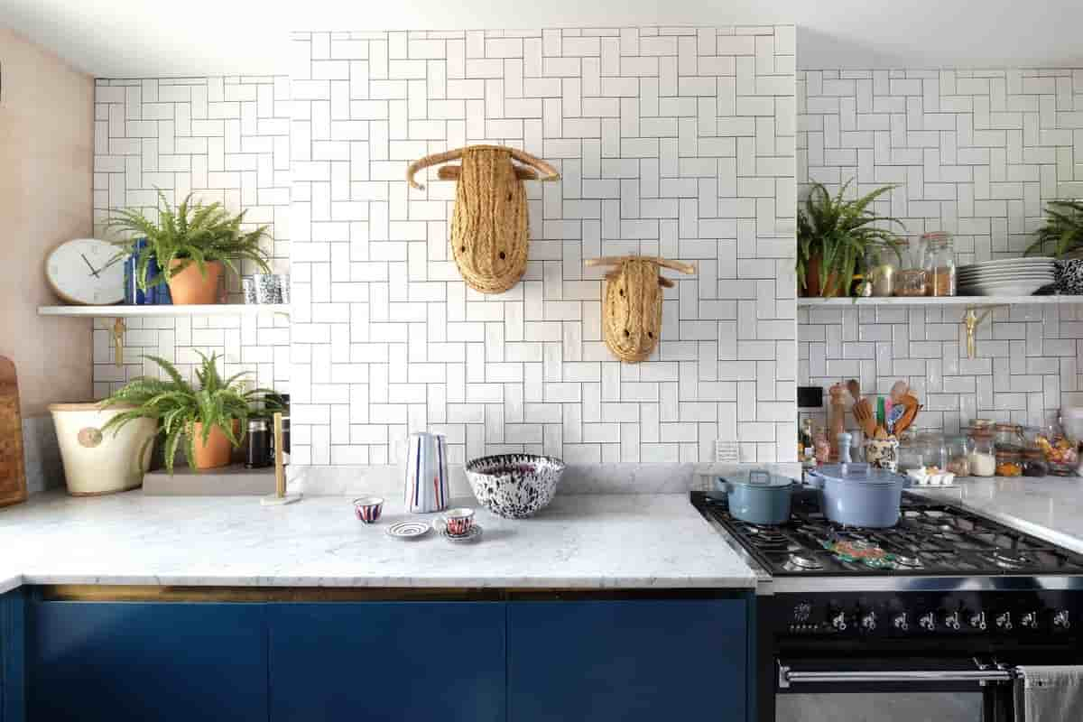
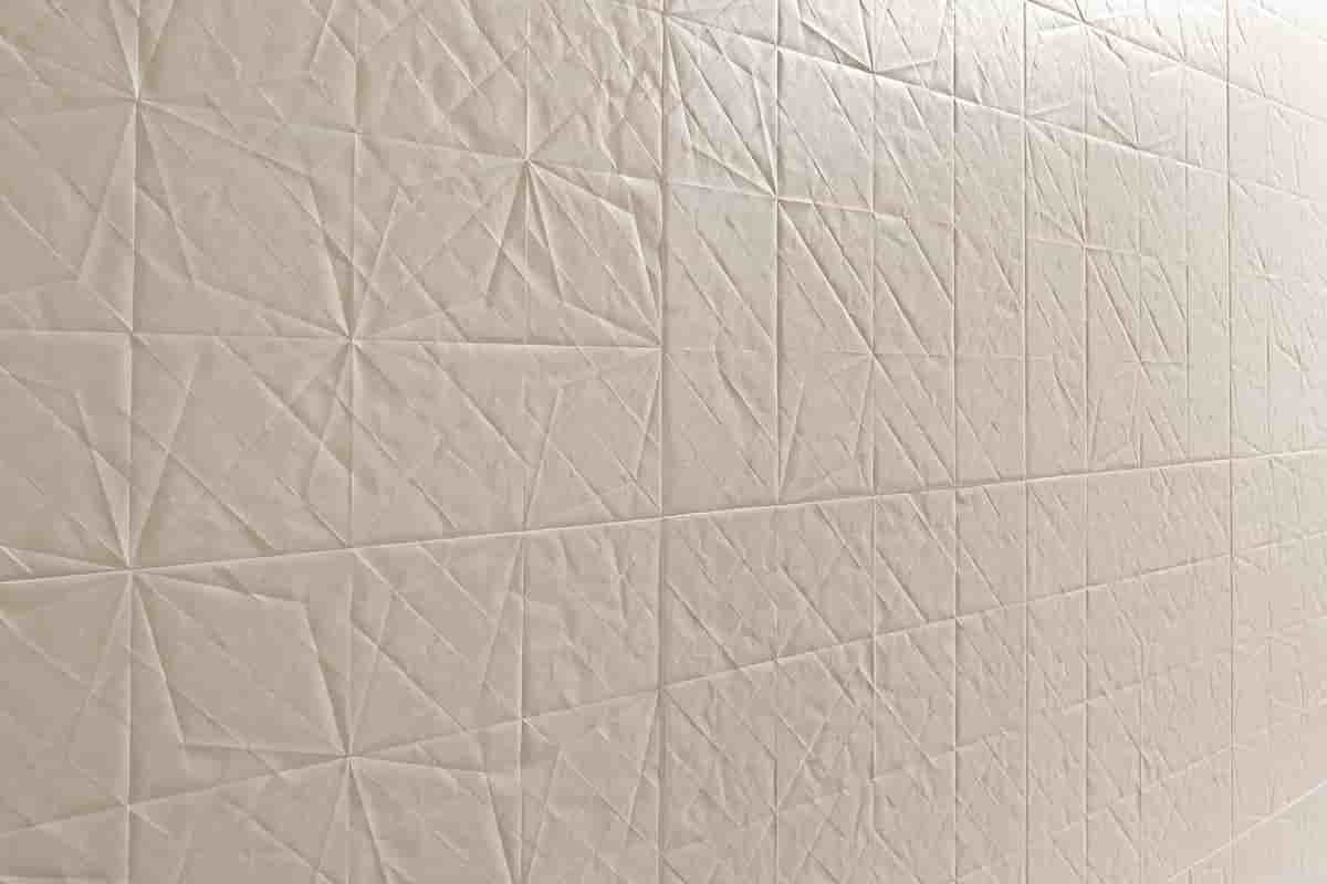
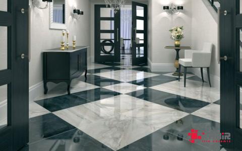
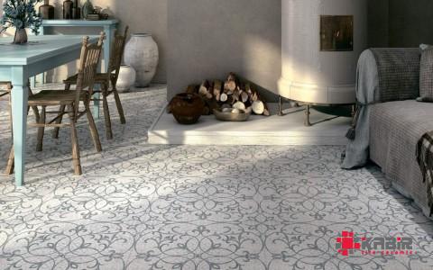
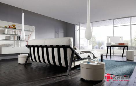
wall tiles to enhance the comfort of your interior
although the top surface of any kind of tile is hard to the touch but it has been proven that the color chosen for the tile can Bring a sense of softness and comfort in the interior of your house.
Orange tile may be the best option for you if the environment you’re trying to create needs a jolt of vitality. Orange is associated with feelings of happiness, excitement, encouragement, intrigue, creativity, success, determination, stimulation, and attractiveness.
It conjures images of the tropics, bright sunshine, and unbridled delight. It mixes the cheerful and friendly qualities of yellow with the energizing qualities of red, producing a range of different impacts depending on the shade:
- A bright orange color denotes both excitement and warmth.
- Reddish-orange: A yearning for physical exertion, dominance, pleasure, ardor, and desire
- Dark orange: Confidence and ambition
- Gold: A symbol of wealth, prestige, insight, and illumination
Leatrice Eisemen, executive director of the Pantone Color Institute and a color expert, explains that orange is working its way up the ladder of consumer preferences, which means that we may see more orange tile in future projects. Although people have a tendency to either love or hate the color orange, orange is working its way up the ladder of consumer preferences.
How to use orange tile Orange tile can be overpowering if it is used for large applications; therefore, you should consider using it as an accent color or for tiny applications such as a backsplash. Orange, much like red, is a color that is known to promote appetite, making it an excellent choice for tile used in kitchens.
A space that needs a lot of energy, such as an exercise room, is a great place to use orange. As a bonus, ceramic tile is water-resistant, slip-resistant, and sweat-resistant, so it’s a great choice for these kinds of rooms.
In general, you will require a lesser amount of the color orange if it has a brighter tone. In a similar vein, oranges that are lighter and more subdued, such as apricot, peach, terra cotta orange, and dusty orange, work exceptionally well for bigger tile applications or spaces, as well as more relaxing areas, such as bedrooms.
Keep in mind that although vivid orange tile may seem daring during the day, it can have a welcoming and comfortable atmosphere in the evening.
Think about combining a bright orange tile, such as orange tile, with yellow and pink accents to evoke a feeling of vitality and enthusiasm.
On the other hand, consider combining apricot orange tile with deep grays and browns to create an environment that is more relaxing. To create the feeling of a harvest or fall harvest, pair orange tile with accessories or other interior design that are gold, brown, or red tile.
Yellow tile, which has the appearance of sunshine, inspires vitality, happiness, joy, and intelligence. Some believe that the color yellow can even boost communication and creativity, in addition to the neurological system and memory.
Nevertheless, it is essential to pick the proper shade of yellow, as drab yellows can be more draining than energetic, while brilliant yellows can be overpowering:
- Dull yellow represents jealousy, illness, deterioration, and caution (rarely used in interior design)
- Joy, receptivity, and intellect denoted by a light yellow color
- Sunny yellow stands for optimism.
- Dark yellow is symbolic of sophistication.
How to use yellow tile: Yellow tile looks great in dining rooms, kitchens, and bathrooms. It is also a good choice for backsplashes.
Yellow tile, which gives the impression of light, is an excellent choice for corridors and other areas that do not have windows; nevertheless, you should seek for a shade of yellow tile that is very bright and saturated.
Because there are so many different tones of yellow tile, there is a lot of design flexibility:
- The use of pale yellow tile creates the impression of more space.
- A neutral that is both calming and tranquil, muted yellow tile is a great choice for flooring.
- A home decorated with sun-kissed yellow tile brings the warmth of the sun into the space.
- The buttery yellow tile adds a warm and inviting tone.
- Muted gold tile and pale ocher tile are two yellow tones that will never go out of style and are easy to work with.
- To create an atmosphere conducive to relaxation, combine terra cotta and purple tile with earthy yellow tile.
- Golden tile and honey yellow tile make for a beautiful combination when used with natural wood cabinetry to produce a cozy and inviting ambiance in the kitchen.
- A refined atmosphere is created by the use of dark yellow tile with gray highlights.
Green, the hue of grass, leaves, and other components of nature, is also the color that is most soothing to the human eye. The color green is associated with rejuvenation, development, fertility, new beginnings, and harmony; decorating a room with green tile can give people a sense of emotional safety, security, and tranquillity.
- Yellow-green denotes happiness and a sunny disposition
- Water symbolizes defense and the ability to emotionally heal.
- Olive green: Peace
- Dark green: Ambition
The use of green tile Green tile is a color that is versatile enough to be used in every room of the house. Investigate the following concepts to see how you might use green tile into your home:
- A monochromatic color scheme can benefit from the addition of contrast with several hues of green tile.
- A natural and unprocessed appearance can be achieved by using green tile in conjunction with tones of wood.
- For a more contemporary look, use gray tile as an accent to light green tile.
- White color schemes that include bursts of lime green tile can be really effective.
- To produce an ambiance conducive to relaxation, combine blue-green tile with tile in shades of gray and white.
- The use of tile in an emerald green hue creates an atmosphere that is both dramatic and elegant.
- A subdued appearance and quiet disposition are produced by evergreen, spruce, and other deep greens.
- Sea green tile gives a room an impression of spaciousness and openness.
- Tile in a celery green color is a well-liked option since it can be used in a variety of settings and looks great in all of them, including the living room, the bathroom, the kitchen, and other open spaces.
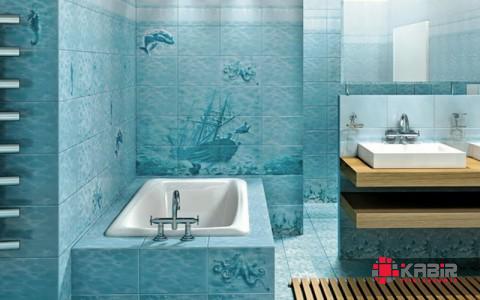
Blue tile, which is reminiscent of the sky as well as the sea, evokes thoughts of cleanliness and serenity, as well as power, reliability, honesty, confidence, loyalty, trust, knowledge, wisdom, faith, and heaven.
This primary color has been shown to have a calming impact on both the body and the mind, as well as a reduction in blood pressure, a lowering of the heart rate and metabolism, and other physiological effects. Obviously, the effect is reliant on the particular tint of blue that is used. Take, for instance:
- Light or pastel blue is associated with wisdom, recuperation, wellness, peace, and gentleness.
- Dark blue signifies solemnity, honesty, strength, and expertise.
- The color midnight signifies luxury.
How to make use of blue tile Because of its relaxing effect, blue tile is an excellent addition to any room in your home where you want to be able to rest, such as your bedroom, your bathroom, or your kitchen. In addition, blue tile is becoming increasingly popular for usage in the creation of unique blue backsplash patterns.
Although traditional blue was chosen by Pantone as the color of the year for 2020, there are different hues of blue tile that enable you to create a specific atmosphere with your design:
- A lively atmosphere is created by the combination of bright French blue tile and sunflower yellow accents.
- The addition of tiles in a sapphire blue hue gives a room a jolt of vitality.
When placed on the ceiling, tile in shades of sky blue, baby blue, and other light blues creates an atmosphere of calm and can even give the impression that the room is larger than it actually is.
- A touch of drama is added by the use of navy blue tile and other dark colours.
- The traditional combination of blue and green tile is considered to have a relaxing effect on people.
- The use of teal and turquoise tiling creates an atmosphere reminiscent of the beach.
- A statement can be made or an accent can be added with vibrant blue tiling.
- The use of blue and white tile together produces an energizing visual effect.
The most opulent appearance possible can be achieved by using midnight blue tile with amethyst undertones.
Your comment submitted.